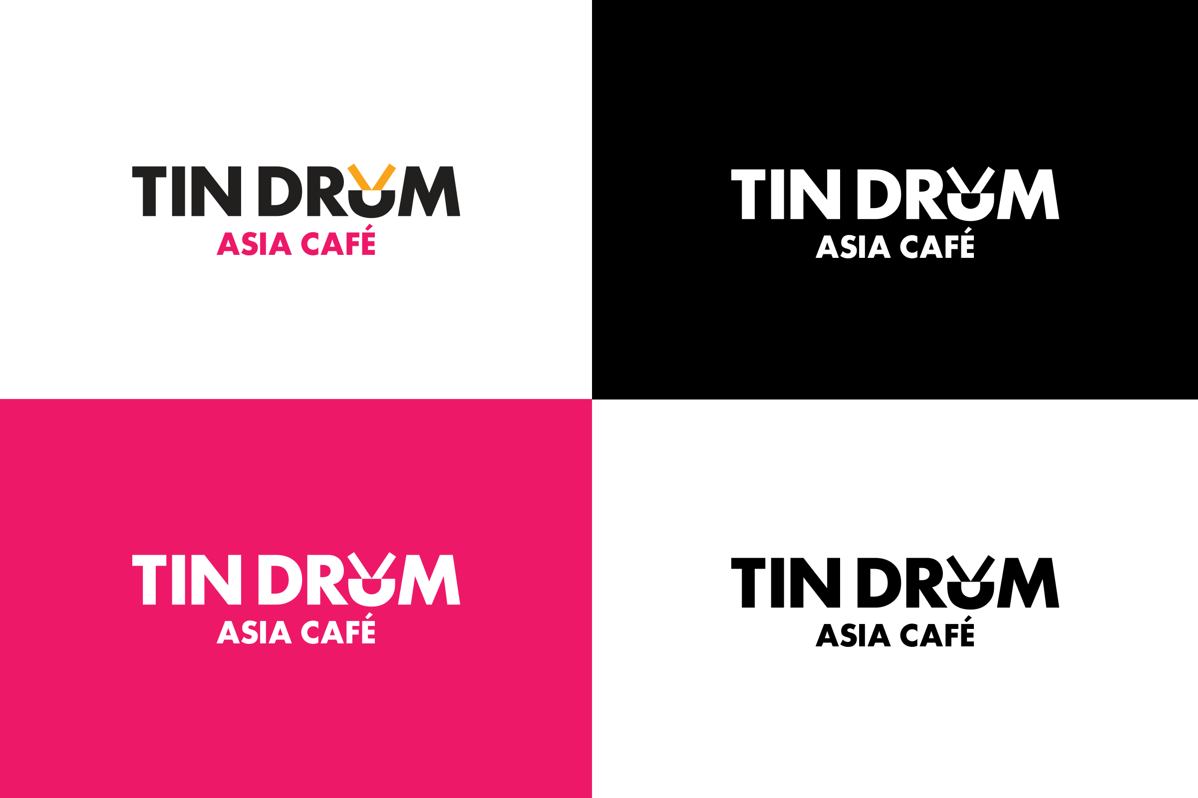
A compact, yet memorable mark and easy to use website was the goal for the Tin Drum rebranding. As a restaurant chain, they had to be aware of restrictions for outdoor signage but wanted a bold and flexible branding system.
Creative Director: Stefán Kjartansson
Art Director: Mariel Harding
Art Director: Mariel Harding
The U in the logo, or “U-con” as it eventually was named, became a central, flexible building block for the brand.
A memorable icon for use on its own in digital applications or as a pattern.


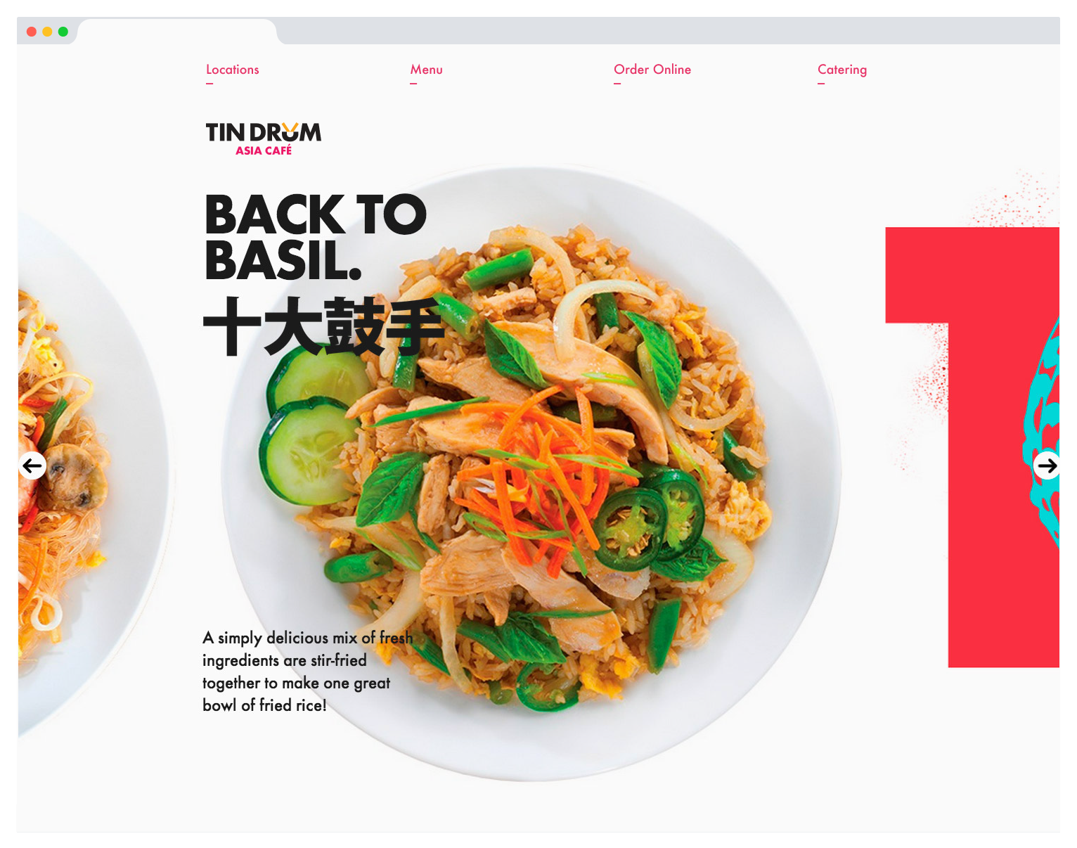
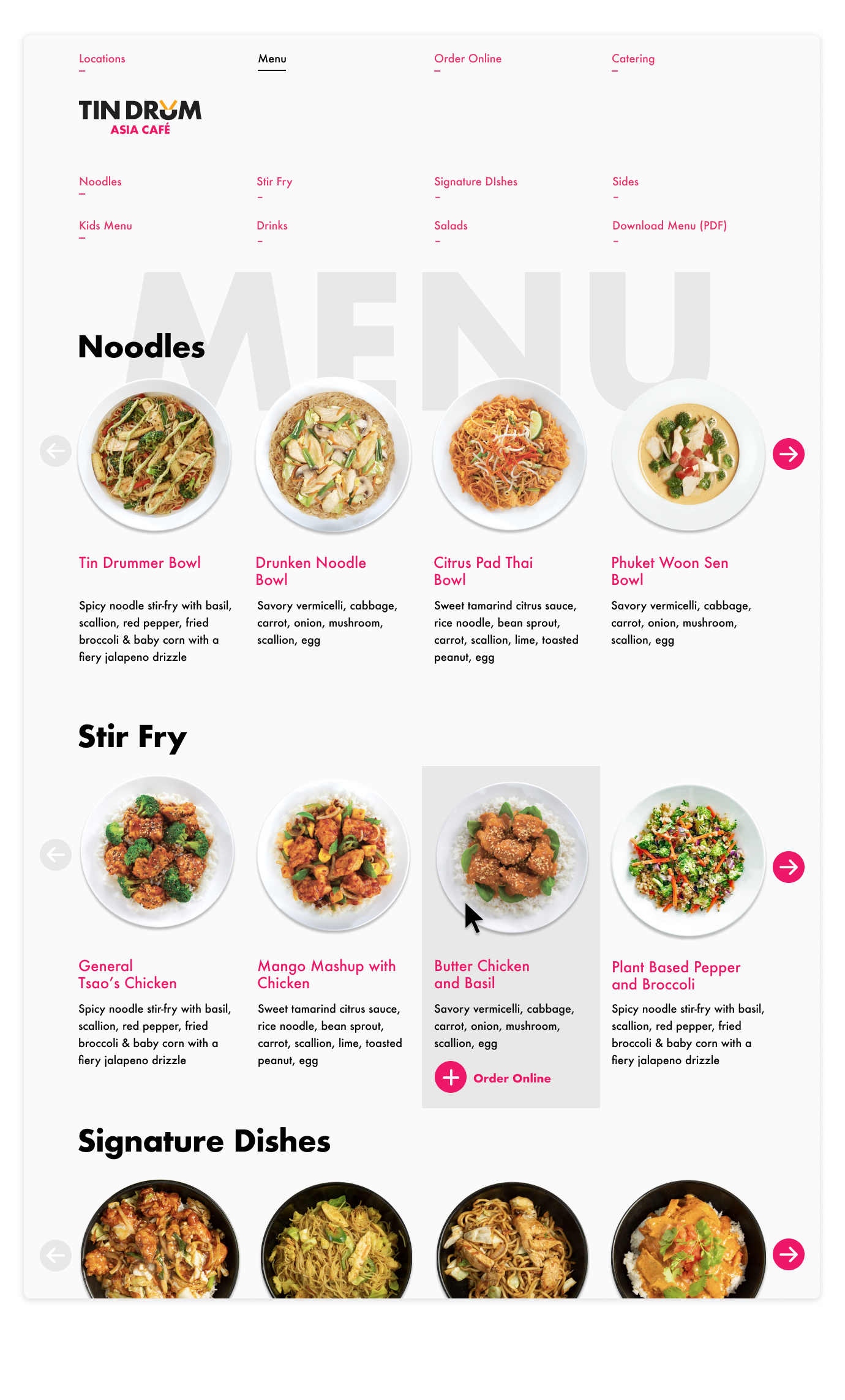
We designed a site that featured Tin Drum’s beautiful food photography and delicious dishes, as well as a full online menu and ordering system.
![]()
![]()
![]()
The website was also designed to be fully responsive and optimized for users visiting the site via a mobile phone.
![]()
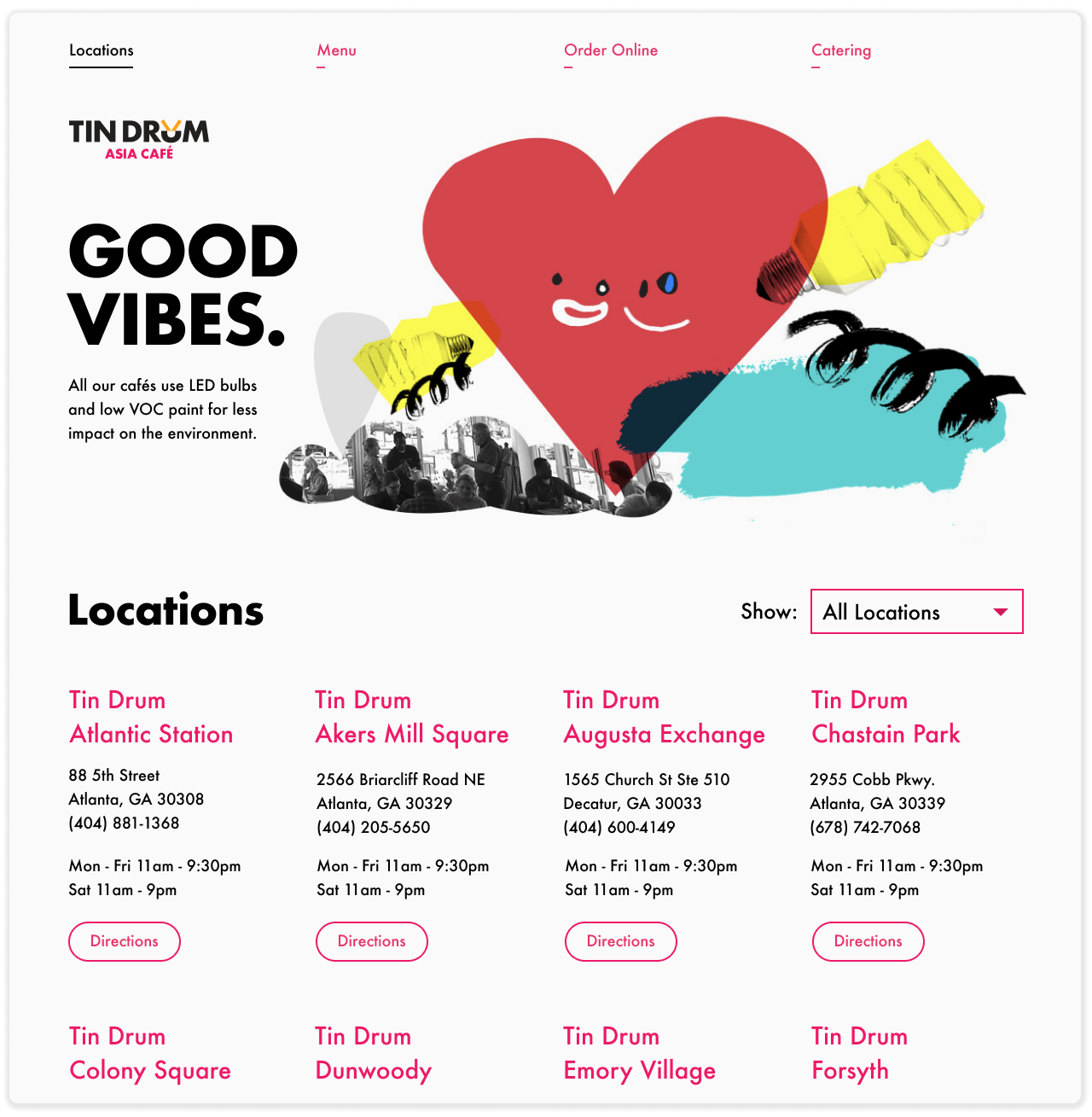
For Tin Drum’s marketing materials we created playful illustration style that incorporated hand drawn elements and snapshots from various Tin Drum locations.
The website was also designed to be fully responsive and optimized for users visiting the site via a mobile phone.

For Tin Drum’s marketing materials we created playful illustration style that incorporated hand drawn elements and snapshots from various Tin Drum locations.


