Creative Director: Stefán Kjartansson
Art Director: Mariel Harding
Art Director: Mariel Harding
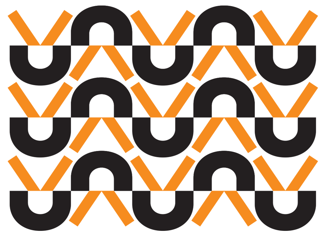
The U in the logo, or “U-con” as it eventually was named, became a central, flexible building block for the brand.
A memorable icon for use on its own in digital applications or as a pattern.

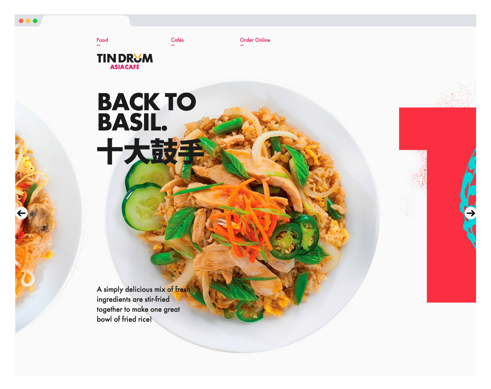
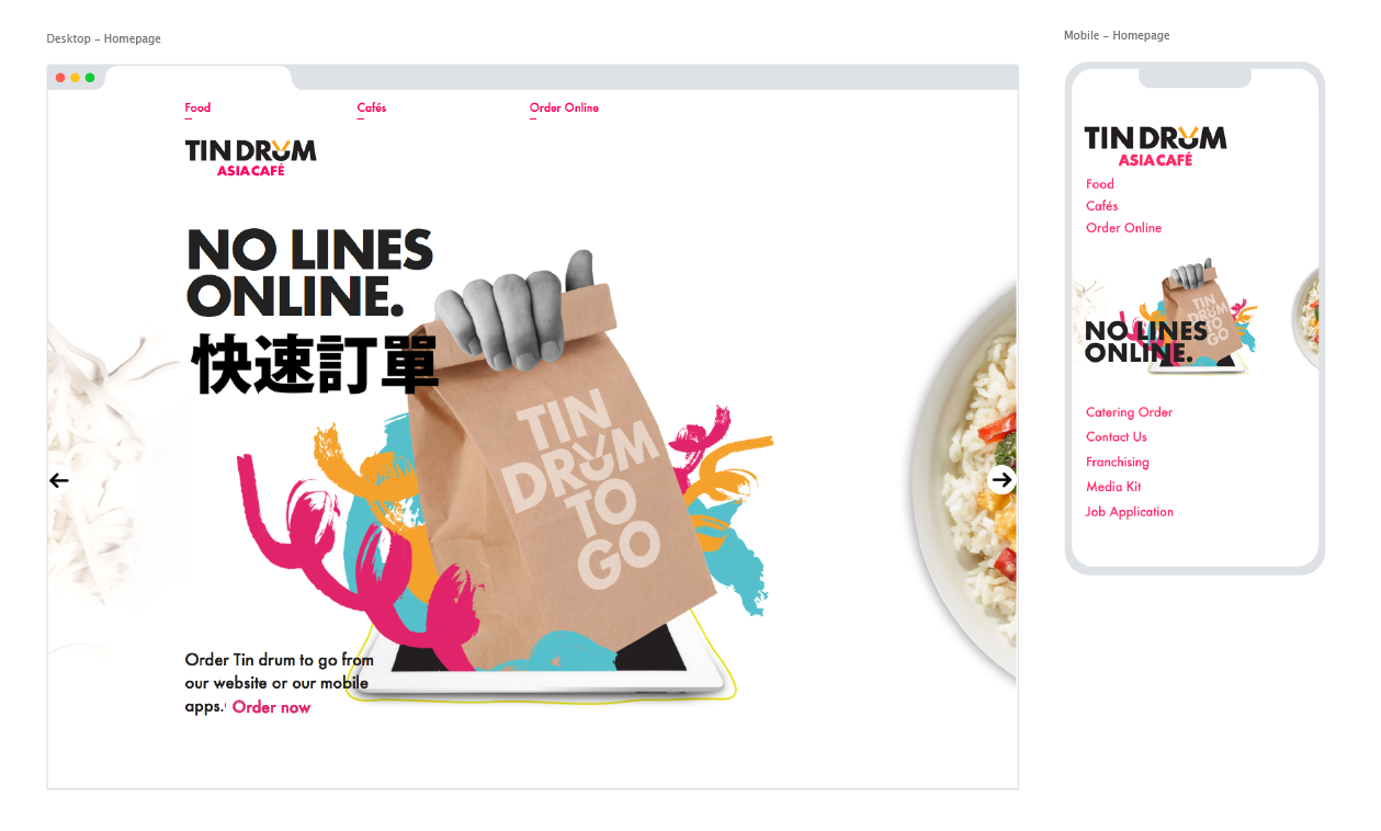
We designed a responsive site that featured Tin Drum’s beautiful food photography and delicious dishes, as well as a full online menu and ordering system.
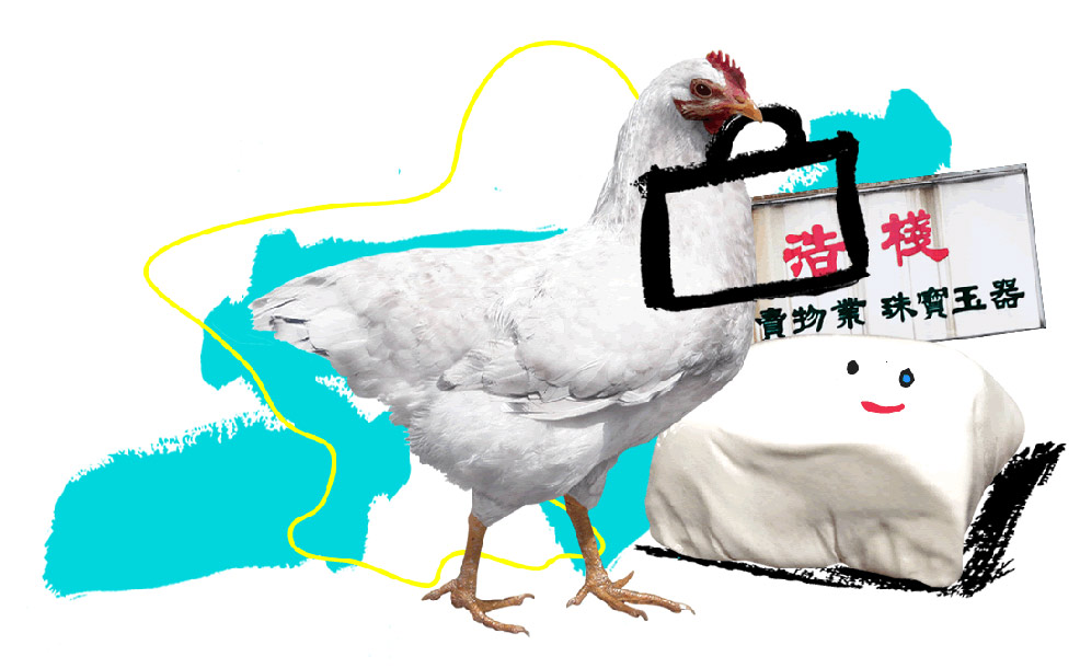
For Tin Drum’s website and in-store materials we created playful collages that complimented each of their core operating principles.


