LifeData
LifeData creates products that help researchers gather accurate data through timed surveys sent to people throughout the day. LifeData hired me to create a new logo, branding system and UI guidelines to reflect their unique and human approach to experience sampling technology.
My Role: Freelance Visual Designer
My Role: Freelance Visual Designer
Creating a new logo that symbolized the connection between data and human life was one of the primary design goals.
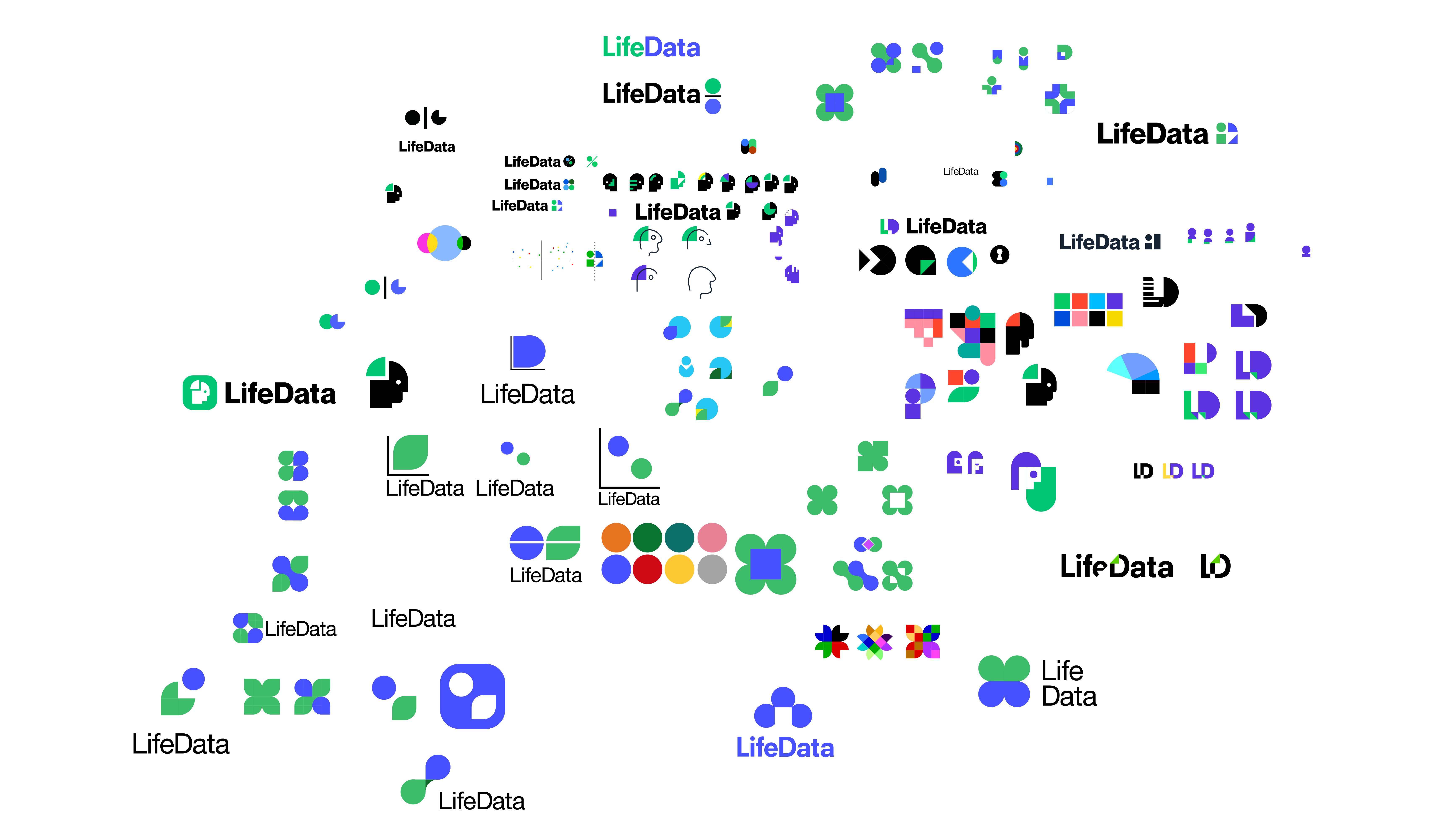
This was challenging to convey in a concise and simple way. After exploring lots of ideas, I landed on an icon that represents a thought bubble, and also suggests the upward trajectory of a chart.
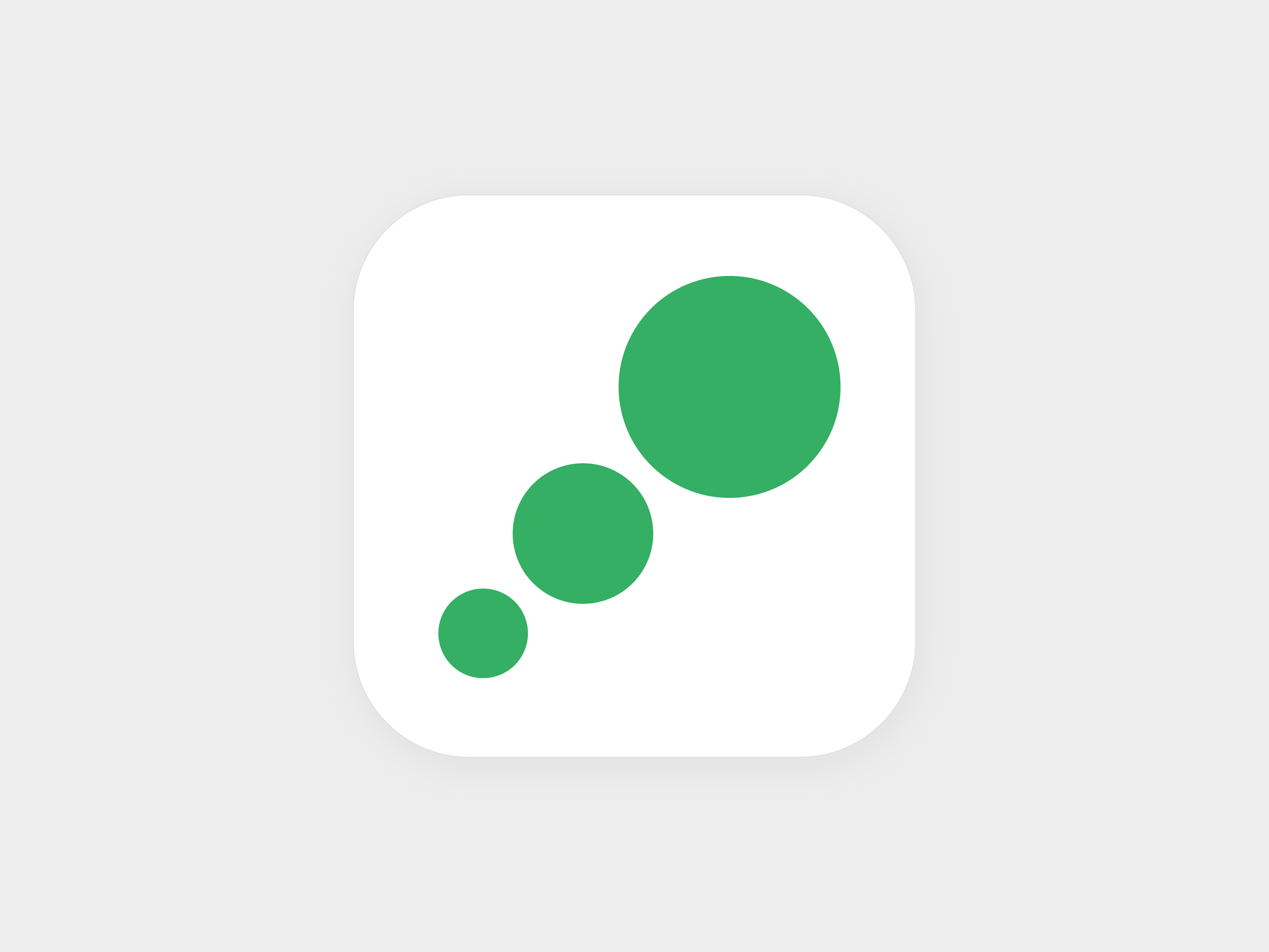
One of the primary uses for the icon is in LifeData’s experience sampling app, so having an icon that fit well into a square was also one of the priorities for the rebrand.
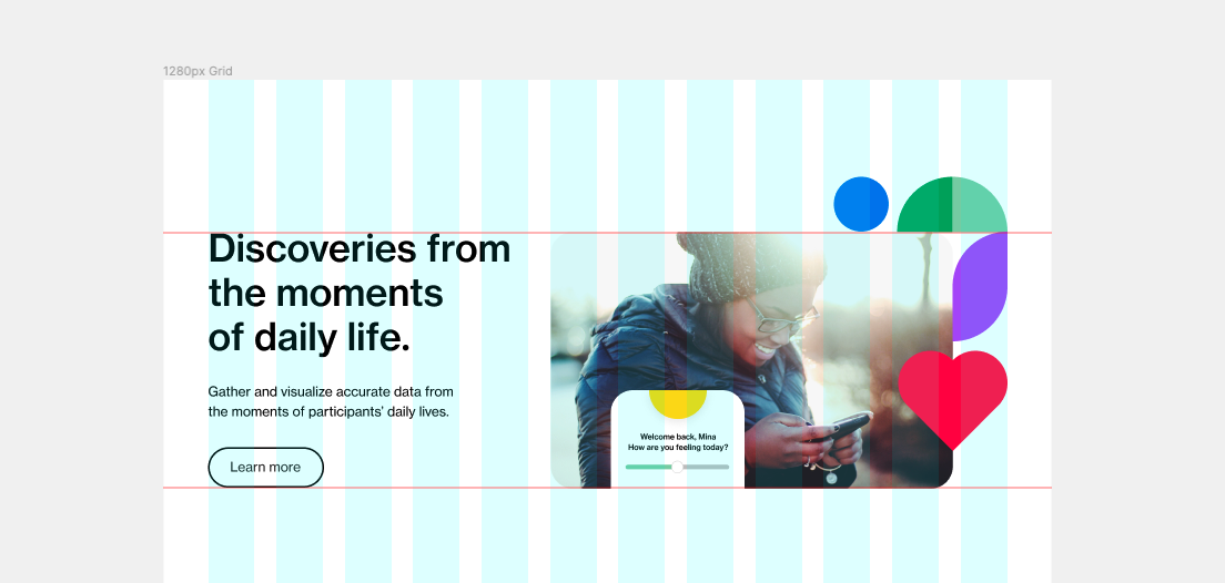
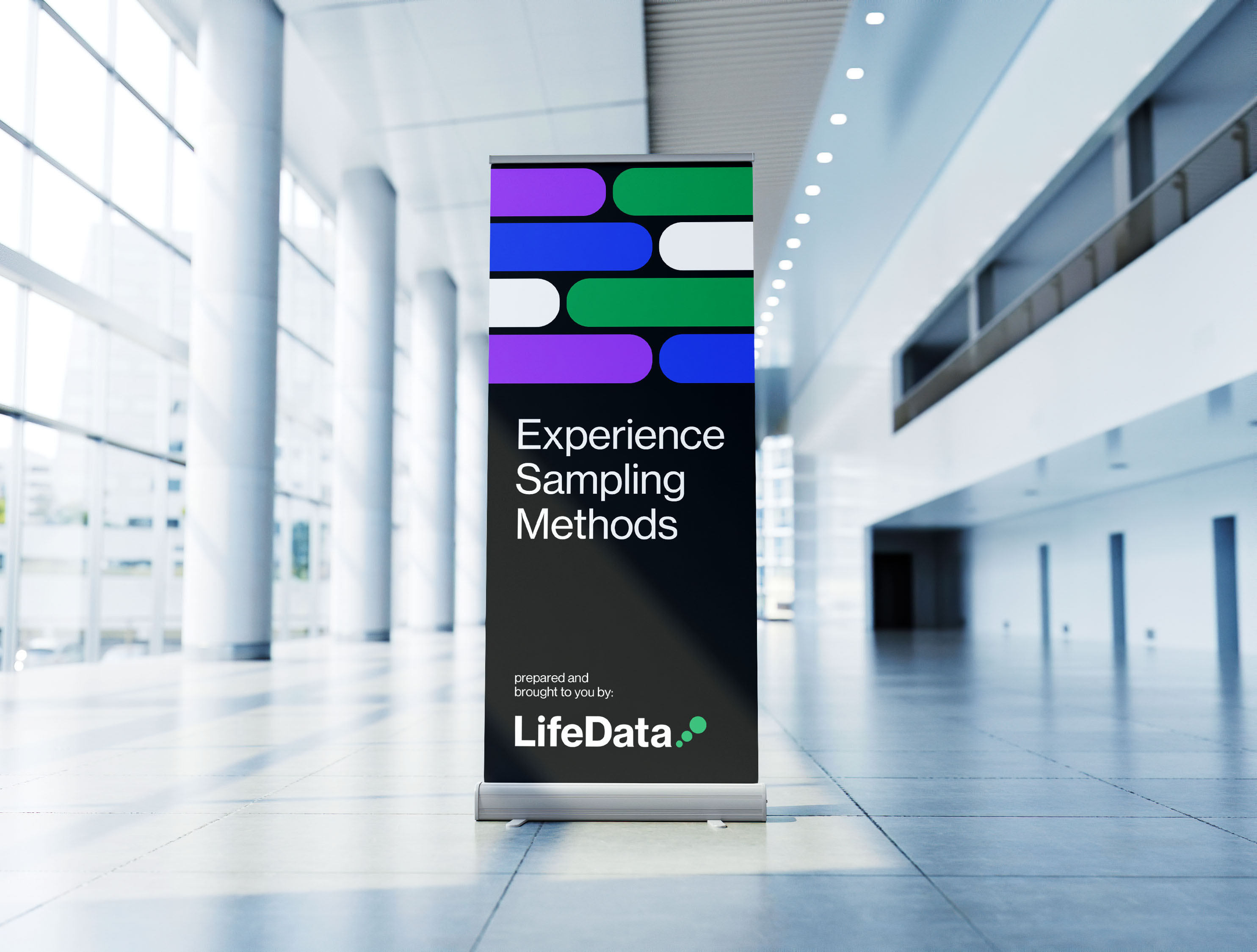
The simplicity of the icon and logo allows for a friendly and flexible design system. The shapes in it can be echoed throughout the website and UI concepts in various ways.

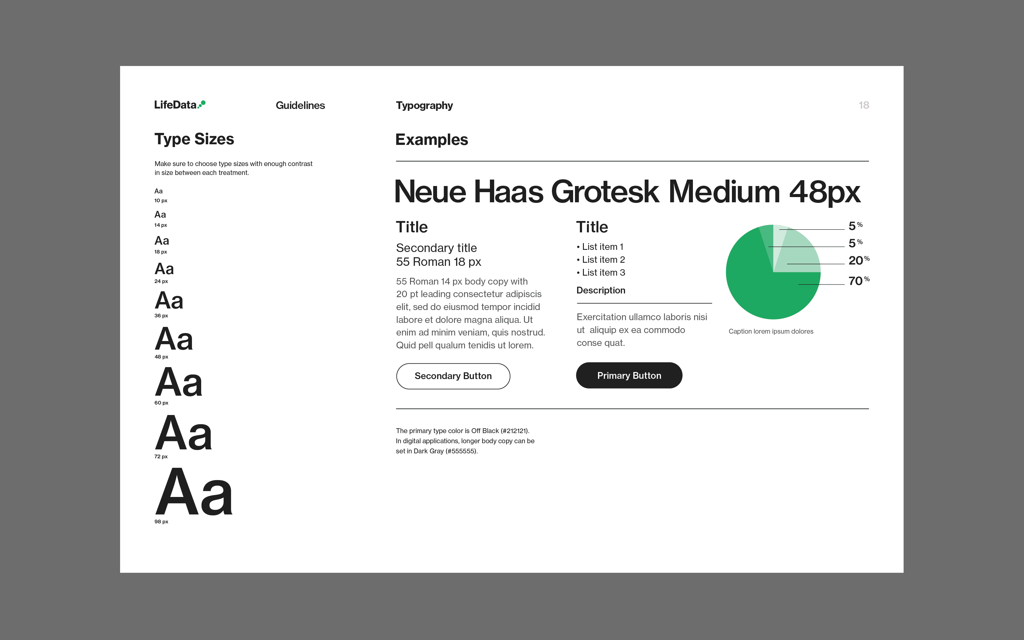
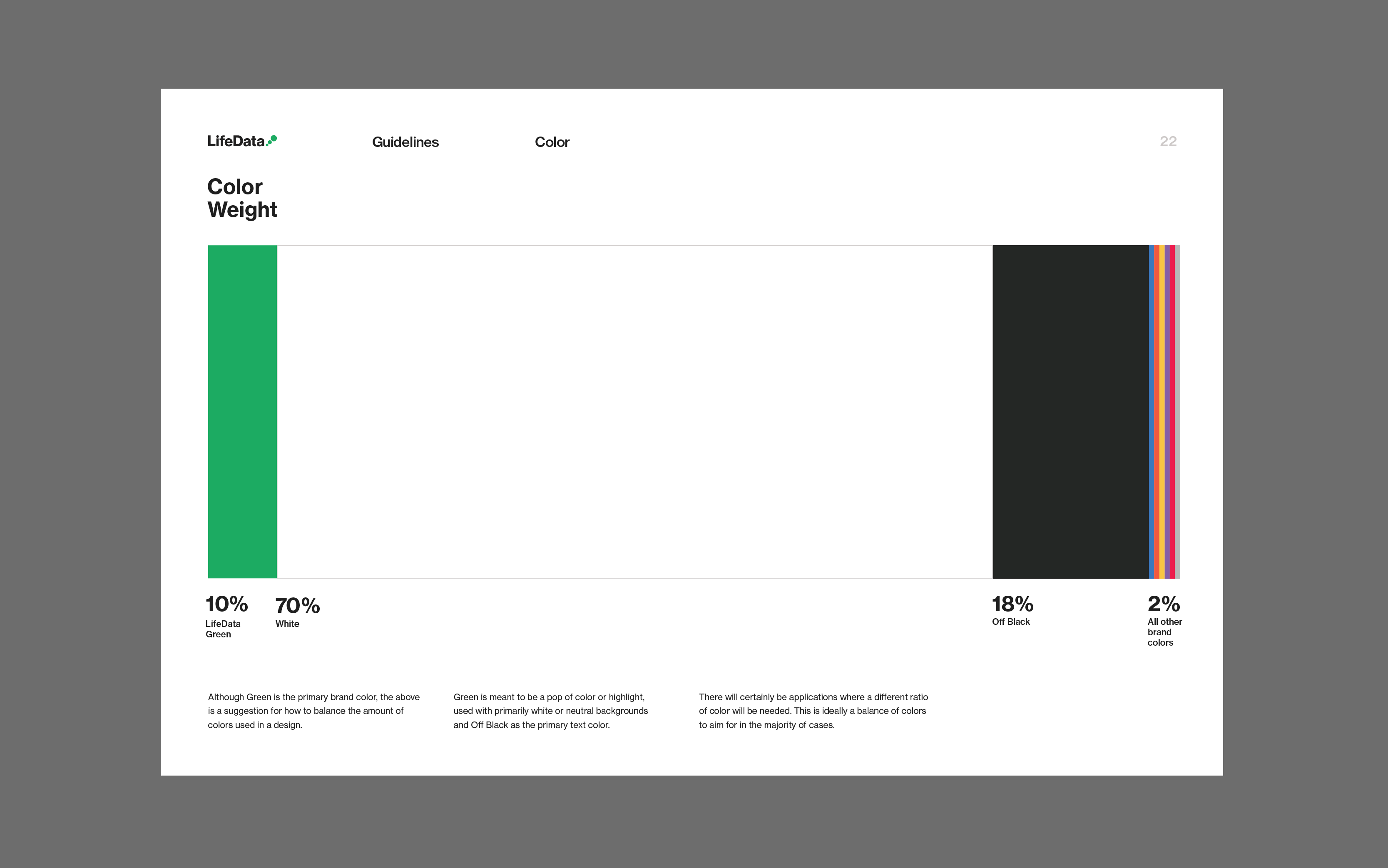
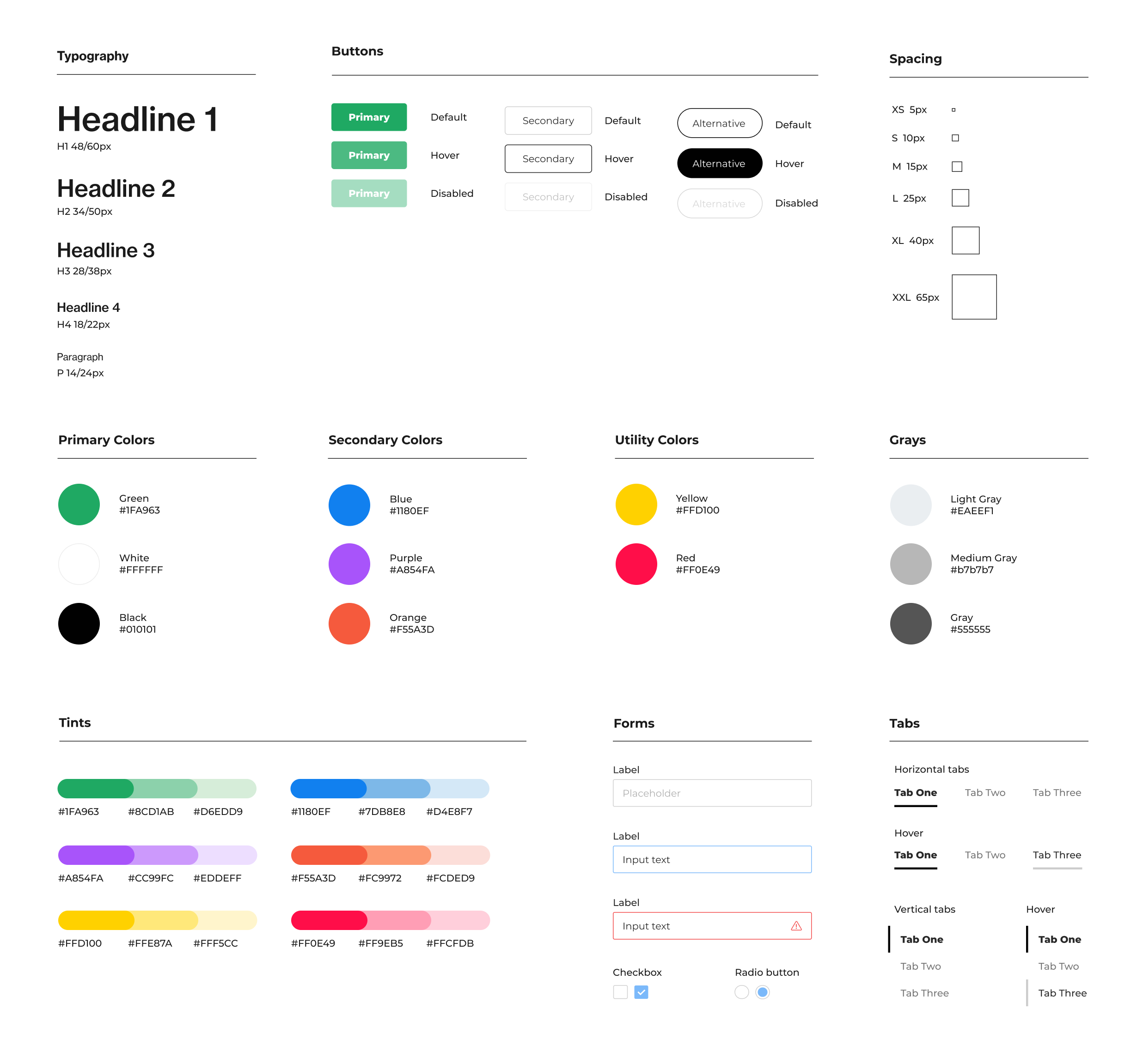
At the end of the project, I created guidelines to cover the use of brand colors, typography, photography, graphics and the logo.

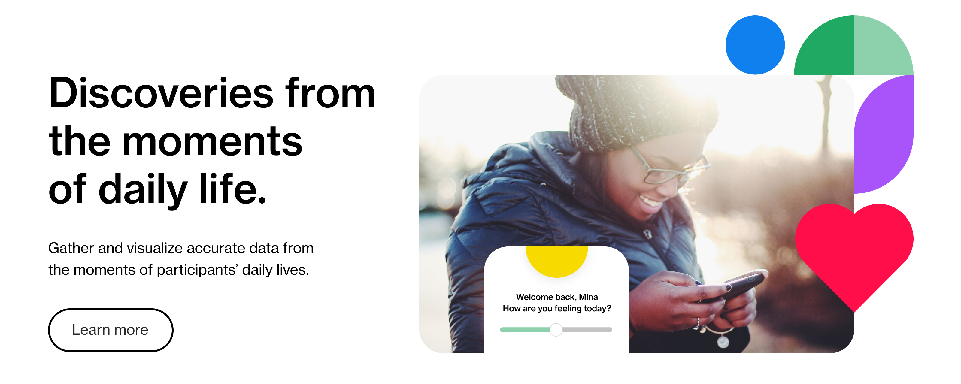
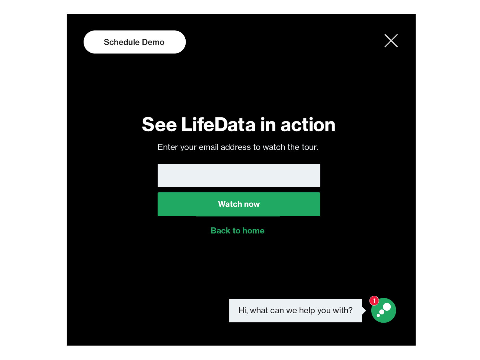
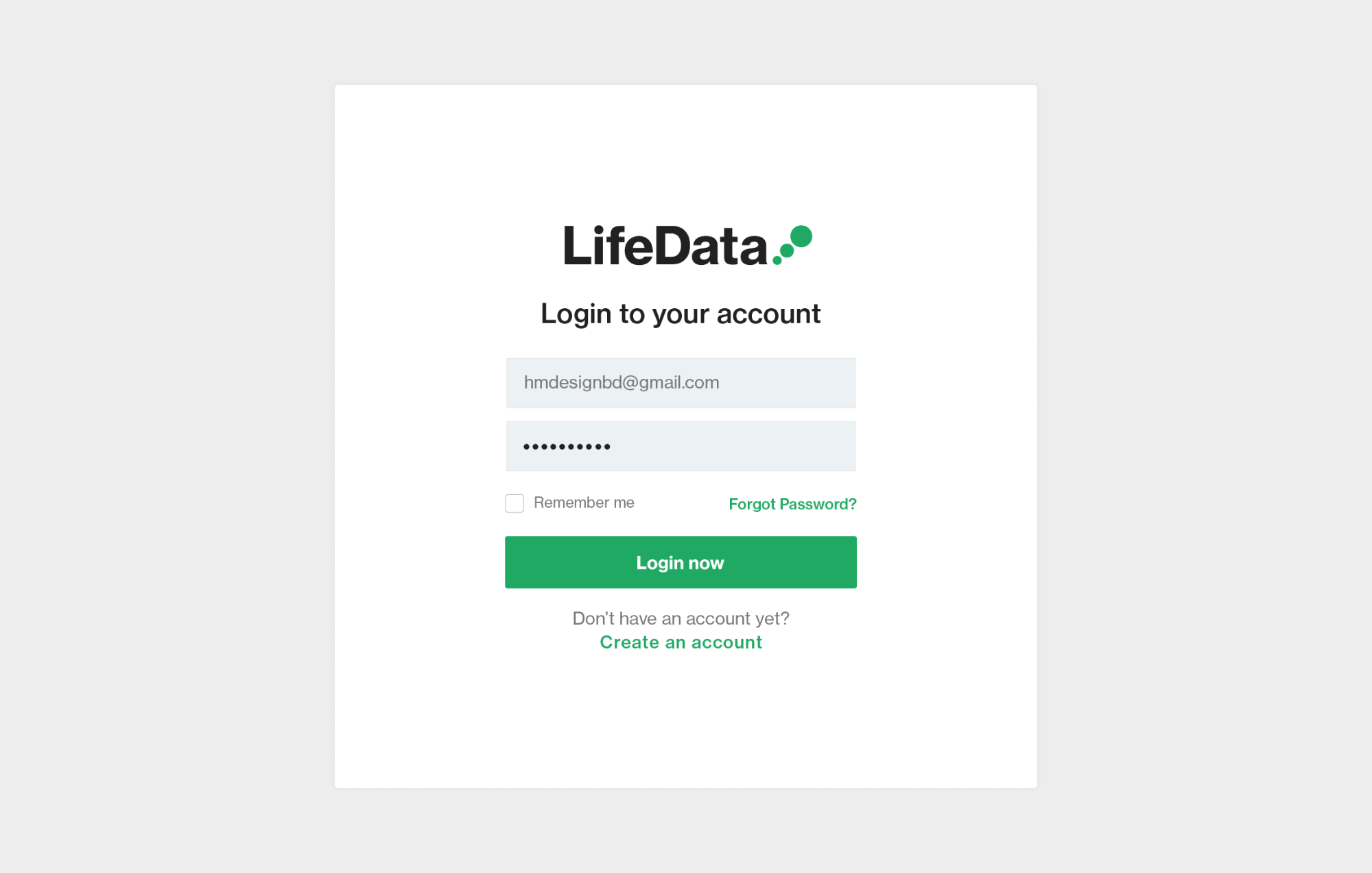
Basic UI design guidelines were established to help LifeData’s internal design team have a consistent baseline for designing and implementing the new brand look.
Photos used in this casestudy are from Generated Photos and Unsplash.
