A digital platform and toolkit for Coca-Cola comprised of code and design elements that allows each market to harness the power of the Coke brand, customizing what’s important to it, while maintaining site consistency around the globe.
I was the lead designer on this project for two years. I helped design the initial concept and additional components as the Coca-Cola markets needed them.
Creative Director: Stefán Kjartansson
Senior Designer: Mariel Harding
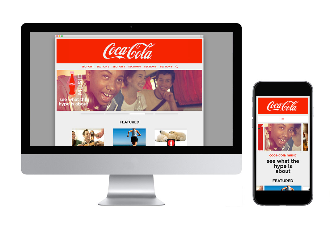
The homepage design features an oversized header that really gives the classic Coca-Cola logo script emphasis and room to breathe. Hero Images drop down behind the logo in a unique way that catch the users attention. Progress bars keep track of which image it’s on and allow the user to control the image carousel.

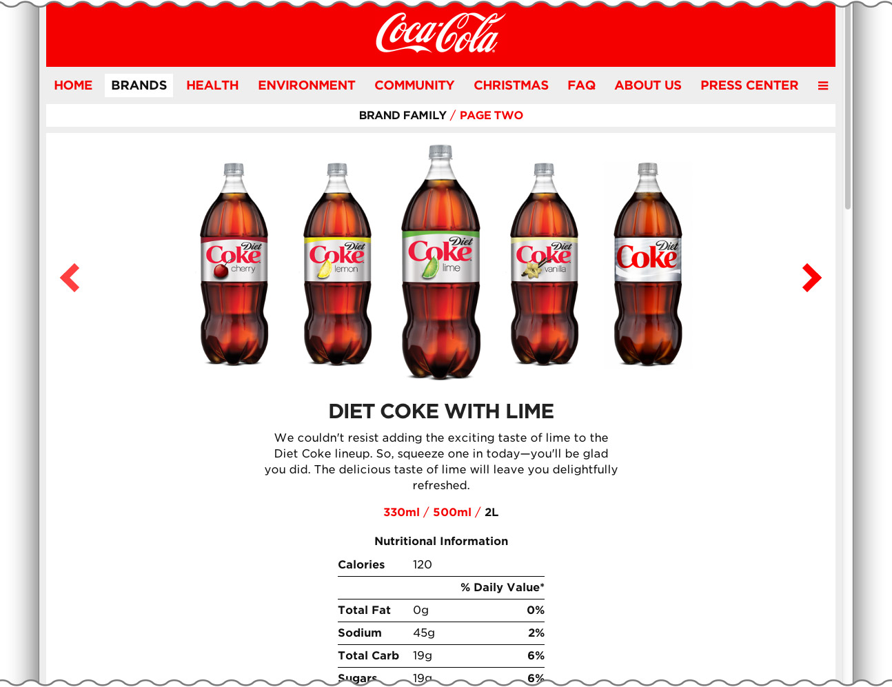
Putting a site's content front and center is emphasized in the design. A neutral backdrop and interface allows the brand's personality and content to shine. For the Coca-Cola brand, the website is based on a gray color palette and classic typography while proportioned to give the brand a larger-than-life impact.


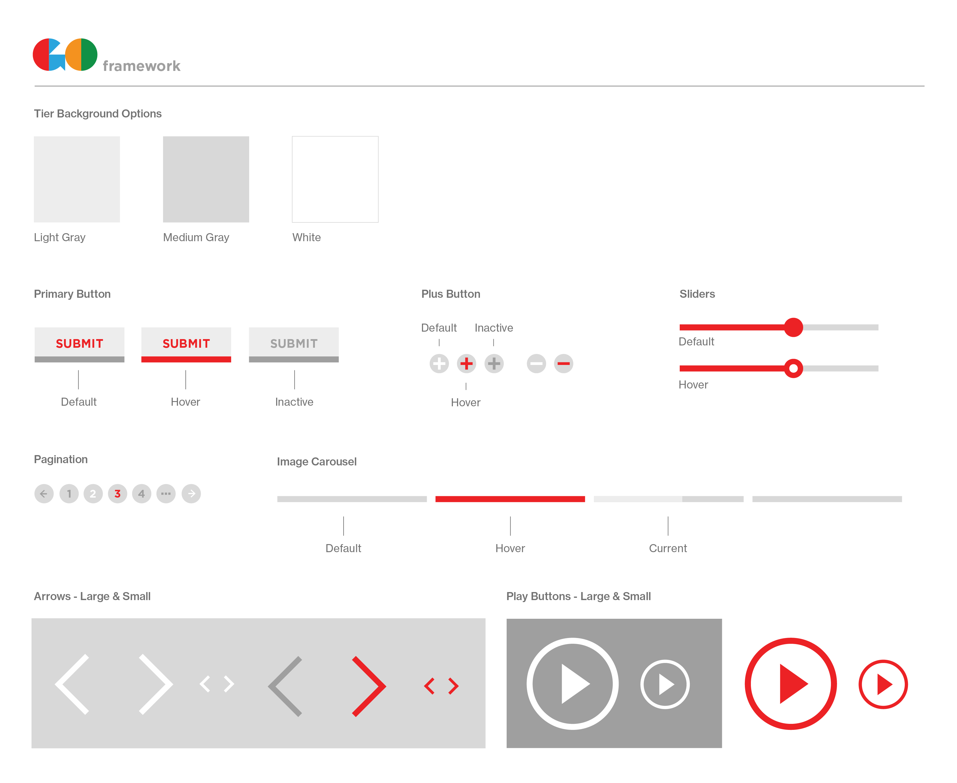
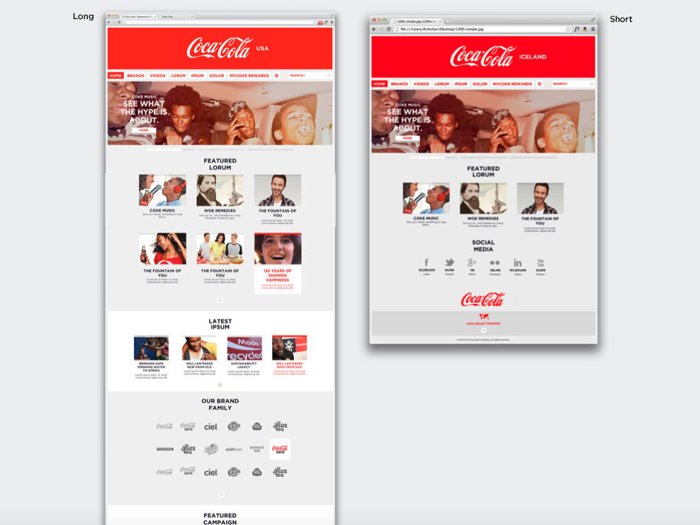
The end result of creating the toolkit was stackable and rearrangeable components that allowed each market to have a responsive, easy-to-update site with as many or as little layers as needed.


The responsive framework and toolkit for Coca-Cola were so well received, our agency was hired to design eight additional versions for the top “sparkling” brands: Sprite, Minute Maid, Fanta, Powerade, Fuze Tea, Burn, Ciel, and Diet Coke. More about that here.
